Happy New Year!
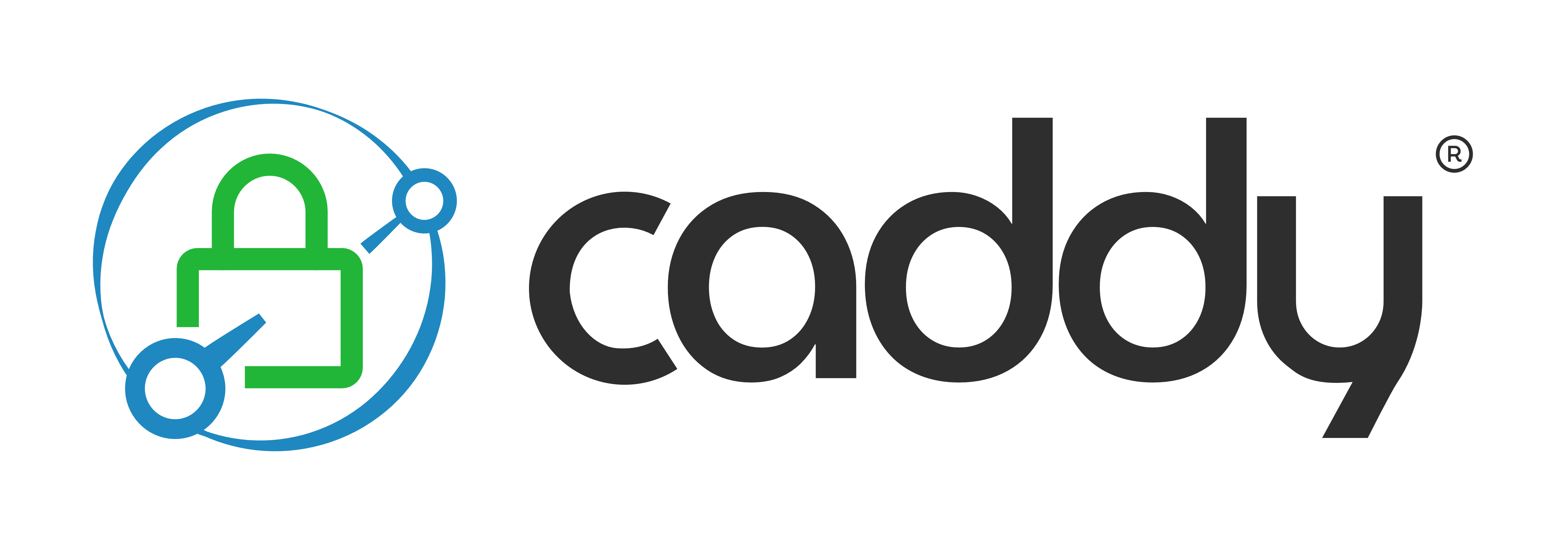
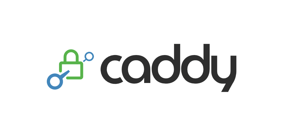
You may have noticed that Caddy has a new logo:
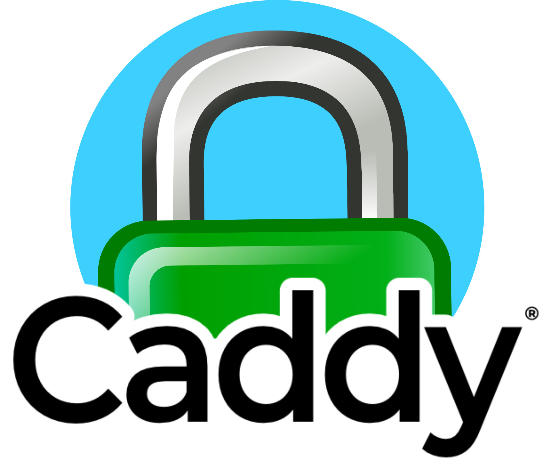
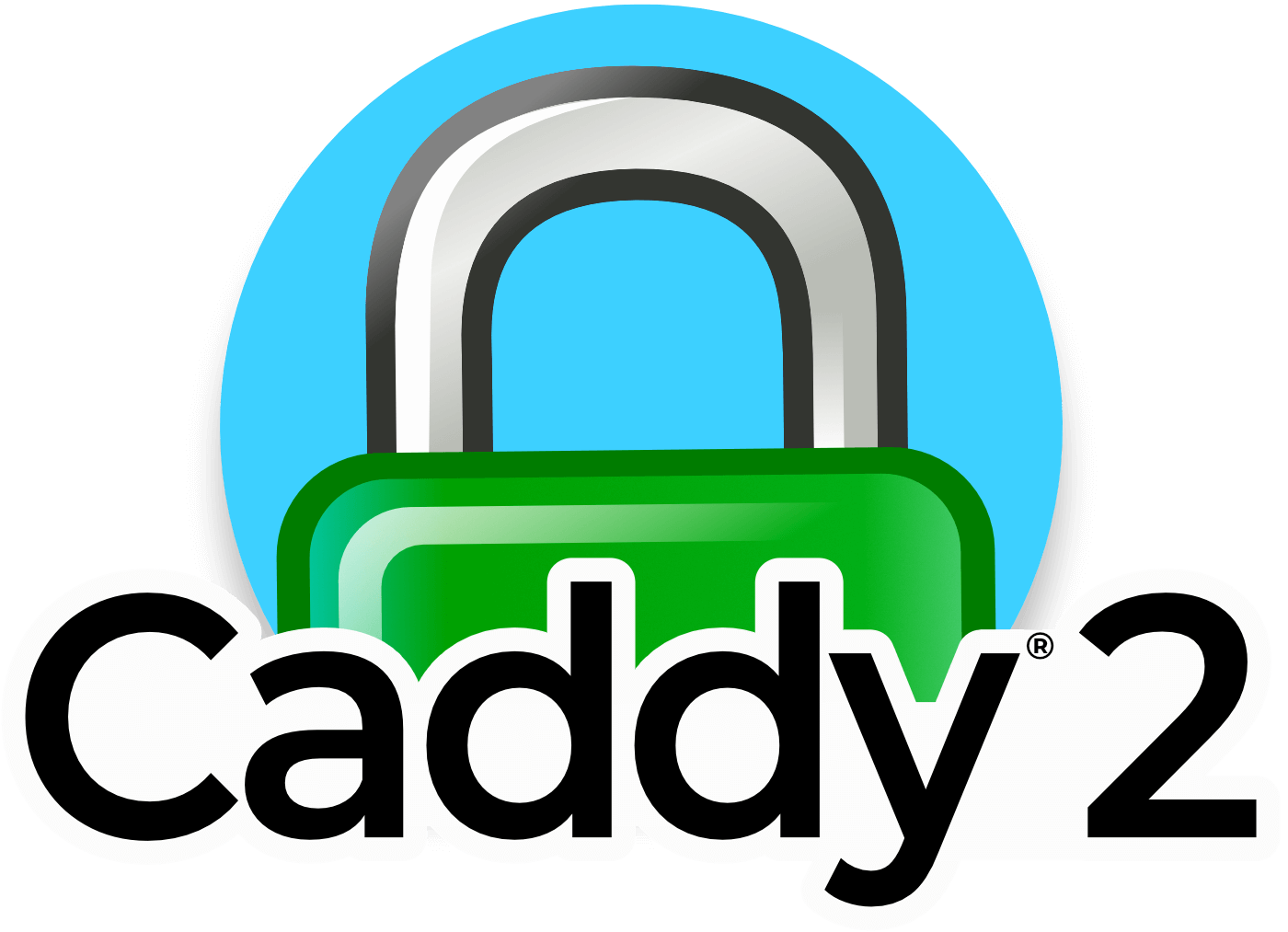
You’ll still see the old logo in various graphics while we transition. For reference, here are some variations on the old logo:

A new logo was needed for several reasons:
-
Technical: the old logo couldn’t be converted to a pure SVG. I’m not a pro graphic designer, but apparently Affinity Designer can’t export shadows, outlines, and layer clipping without rasterizing. This made it impossible for us to display our logo in some places that require pure SVG and was incredibly frustrating.
-
Evolving UI trends and symbol meanings. The green padlock used to be iconic in the legacy days when HTTPS was novel or unique. As you probably know, browsers no longer show green padlocks. Some don’t show a padlock at all. There are several good reasons for this, but the notion of a green padlock meaning a secure connection is quickly becoming obsolete (much like the floppy disk meaning “save”). However, the idea of encryption is far from obsolete. Long live the padlock! Our new logo still keeps the iconic green padlock as an important part of our core values, but with the added symbol of a link going through the padlock from one node to another. In other words, we’ve added context to the padlock of encrypting a connection from peer to peer, which used to stand alone. This helps preserve the meaning through shifting UIs.
-
Portability. The old logo’s color scheme was difficult to use in many settings due to numerous gradients. Notice how, even in the logos above, the gradients had to be different to work with the layouts. Not to mention the vertical layout of the logo involved complexity that is unbecoming of a good logo (IMO).
-
Generic shape. The shape of the old logo was a circle, and it was difficult to make a monochromatic form for use in places where only one or two colors were permitted. This new logo has a distinctive shape even without color, and is more adaptable to its environment.
-
Light and dark modes are common now. The new logo has the same colors on both light and dark mode, except for the text which changes from almost-black to almost-white.
About the new logo
I’m not a profesional designer; I don’t know what I’m doing. So I started by throwing paint at the wall to see what stuck:

I tried a variety of styles from retro 80’s style logos to generic cloud and shield shapes. Not very exciting… in fact, the second variation down on the left originally looked more like a nuclear mushroom cloud when I extended the lines to span the wordmark, oops ![]() :
:

Shortening the lines was better, but that icon still looked too generic.
You can see there was some temptation to make the text look a lot like our current logo, which uses Montserrat, and to even change color schemes. But I think doing either of those things wouldn’t serve our brand very well. Changing colors felt too drastic; and the text needs a refresh to stand out slightly. (Montserrat is extremely popular.)
Finally, toward the bottom, I started to converge on a theme I liked: we keep the blue and green, the font is different and interesting, and there’s the iconic padlock encased by a cloud, which is relevant for environments Caddy is often deployed in. You can tell I debated between “thick and bold” or “thin and light”, which wasn’t quite decided at the time. Bold is nice for how powerful the software is, but a light motif reminds me of quick, nimble, and unbloated.
That typeface is called MuseoModerno, but I had to modify it.
When I showed that final variant (bottom-right) to the team, @francislavoie mentioned how non-native English speakers in particular might confuse the “y” with a “u”, as the y’s descender looks more like a cedilla and the shape is literally a “u” but with a line down the middle. This was a good point. I liked that the y reminds me of a tuning fork: a server that is well-tuned for its task. But, that was not important to me, so I set out to make a custom y that looks a little more like a y, and less like a tuning fork. I converted the letter to curves and did some node wrangling:

About this time, I decided to figure out icon and presented a few more variants to the team:

It was here we decided to go with the thin typeface (though I do still like the aesthetics of the bold, black-text logo at the top with the cloud+padlock over it – it just “fits” visually).
The cloud was one of my favorite icons because it is the de-facto standard icon for Internet services these days. But our team made some good points about clouds:
- Clouds tend to refer to SaaS rather than self-hosted sites. (Even though many SaaS are powered by Caddy.)
- A significant portion of Caddy’s user base is not represented by “the cloud.” These users may be using Caddy primarily because it is self-hosted, not “in the cloud.”
- A cloud is so generic and bland. Yes, it’s pretty ubiquitous these days, but it seems overused.
So I explored the idea of networks or links a little more literally by using circles connected by lines. The middle variant with the “roof” over the padlock makes it look like the network link is skirting around encryption and actually not secure (plus it looks weird). The last variant on that line looked like a bit of a rip-off of Let’s Encrypt’s logo (the “radiant lock”).
Additionally, the more I looked at the capital “C”, the weirder it looked. Frustrated with my attempts at cloud alternatives, I proposed a new variant reluctantly with the cloud, but also with a lower-case “c”:

I felt like this was getting close. The icon is visually pleasing and the meaning is conveyed pretty well, despite the flaws of the cloud, and the lower “c” was preferred.
At the same time, I made one last effort to ditch the cloud with a more literal icon:

But when someone asked, “What is it?” I knew that wasn’t the one. (I didn’t think it looked too bad though.)
I started to feel more confident about the custom “y” at this point too.
But now, that “c” started to bother me. It was narrower than the other letters, but didn’t have the same curvature or “rounding” of the others. It looked too “open” to me. So I made a custom “c” as well. This c was actually derived from the other round letters, which turned out to be a perfect circle, but enclosed more. Overall it was a hit, but someone mentioned how it still looked narrower than the other letters; this is true and expected, as the other letters are nearly perfect circles, and the ‘c’ is a circle with a segment cut out. However, I argued that this has nice properties. Still, I tried stretching it to match the width of other letters:

Top: original c
Middle: custom c
Bottom: stretched custom c
Even though the middle c is still slightly narrower than the other letters, it’s wider than the original, and the curvature is more consistent with the other letters than the stretched c at the bottom. Of all the tweaks or decisions about the logo, this is perhaps the one that was the most divided, or split about 50/50. In the end I just decided to keep the middle c as it has some visual charm and is technically more consistent.
Ok, cool. The wordmark was solved as far as I was concerned. Now for that pesky icon: what should it be?
I still liked the cloud+padlock look, but I experimented one more time with the idea of a node or network. Caddy is famous for encrypting connections. Instead of having a link between nodes go around the padlock, it should go through it. I came up with this very simple yet almost-3D icon (it’s original in the sense that I didn’t copy it from somewhere, though I doubt it’s hardly novel):
I was really liking where this was going. The c and y looked great, and the idea of a connection going through a lock from node to node was a satisfying way to convey our meaning.
With some feedback and ensuing discussion, I lined up 3 subtle variants:

Top: Current candidate
Middle: Stretched c
Bottom: One of the nodes is a cog, representing automation (Caddy itself).
The cog received the most criticism; it’s hard to see when it’s smaller, and it looks a little “busy”. I tried a variation with fewer teeth, which looks less busy but it’s still had to see when small:

Plus, it kind of breaks the “node” or “network” symbology, as cogs aren’t typically used in network diagrams. I dunno, I still think it could have worked, but it isn’t really necessary: Caddy is less often a cog in the machine and more often the machine.
The last remaining feedback – from myself and others – was that it felt a bit “uncontained.” The old logo and the cloud icon both had a sense of boundary or its own space: containment.
Alright, so put it in a circle? I dunno, I’m a simple man and not really a graphic designer. The circle looked boring though. So I varied the stroke pressure and made it look like a bubble. This was more interesting:
But, it made the lines a little too small when the logo had to be small (like in favicon).
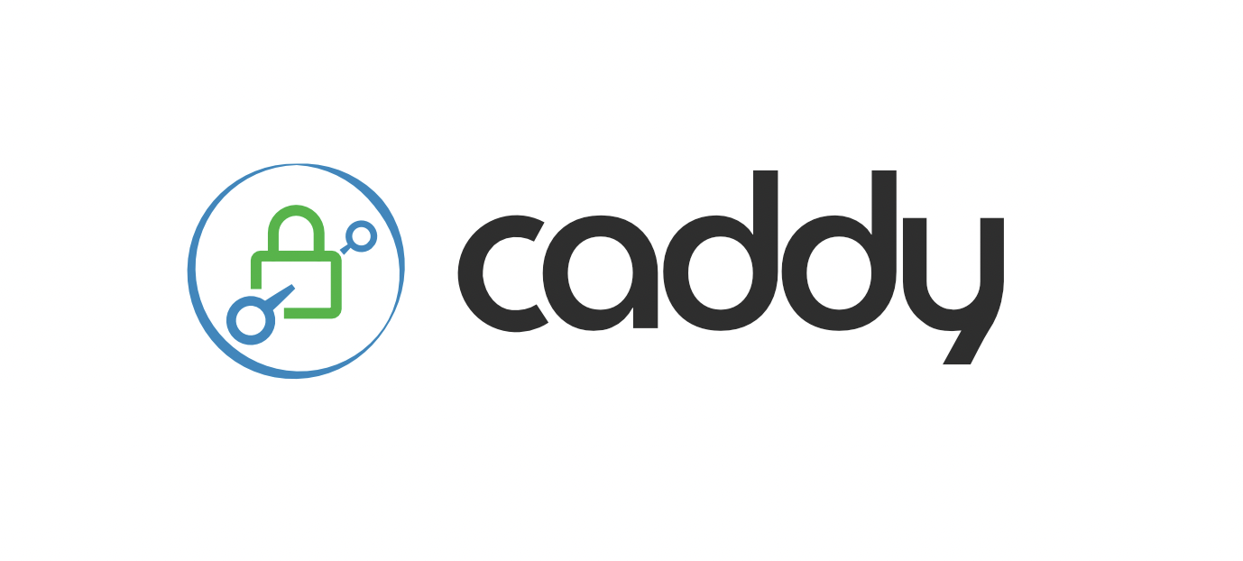
Eventually someone suggested we try having the link go through the bubble, not just the padlock; i.e. have the nodes outside the bubble:

Finally, @francislavoie made a clever suggestion:
What if you did similar to that last one but make the circle bigger to intersect both of the nodes
After some tedious tweaking, I finally figured out how to make that work, and bingo. We got the logo we ended up with today (at the top of this post).
I’m quite pleased with it. We went through many iterations, and I am grateful for the many people – technical and non-technical – I interviewed to arrive at this one. I know sometimes people don’t like branding changes. I hope it will grow on you if you don’t like it yet ![]() We may continue to make small tweaks here and there, but overall I think it will serve us well.
We may continue to make small tweaks here and there, but overall I think it will serve us well.
PS. Thanks, @emilylange, for this gem, as we hashed out the final iterations ![]() :
: